Wednesday, April 27, 2011

Severed Syroco Sadness

I like scroll-y crap. I don't go crazy with it, but I think a bit of it can add some charm to most decor. Especially when the pieces are painted and not left the original brassy gold, the old mirrors and sconces can live comfortably in modern rooms. A couple of years ago, I scored a Syroco Wood mirror at Goodwill for $3 or so.  I'm not sure if I was blinded by love, or if I noticed then, but my dear mirror had a flaw. Part of the scrollwork on one side at the top is broken off. The mirror was put into storage and I unearthed it a few months ago when I brought some things from the storage unit back to this apartment. It has been sitting in the entryway since then, and now I really want to figure out what to do to fix it.

(Please excuse the picture quality. I took this in the hallway and I just couldn't get a good picture of it.)

Did I forget to mention that the rose slapped on the front makes it look like it was used in a low-budget performance of Beauty and The Beast in the part of the (wall version of the) mirror? 


I will definitely be scraping the weird stained glass cling off later. Back to the point! Here is a better shot of the damage.

(Poor thing. At least it was a fairly clean break.)

I have no clue how I can fix this myself. The detail of the scroll and flower is a bit too complex for me to try to replicate with clay or plaster. I am left not knowing where to go from here. Do I try to remove the other part to make it symetrical? Do I leave it like this and hope that people are too stunned by their own beauty to notice the flaw? Do I glue a giant resin bird onto the void or something? Le sigh, guys.

I'm not ready to just throw in the towel. It has promise. This particular mirror looks adorable painted, too. (I'd use a color, though. The white here looks a bit too shabby chic.)


I will avoid embedding a ton of pictures showing painted Syroco or Hollywood Regency-style mirrors by just linking to one of my boards on Pinterest that has a bunch of them. My Gorgeous Inspiration board. It has more than just mirrors pinned, too.

I love you, mirror. And I will try to fix you.

(Gratuitous fan video of a beautiful movie and a sweet, but not entirely appropriate for the situation song. For giggles.)


Saturday, April 23, 2011

Design A.D.D.: The Bedroom Edition

I have a confession. I have a problem with commitment. Design commitment, specifically. I just love too many different styles to nail down ONE way to decorate my home. It is part of the reason I love designing spaces for other people. I get to know their style and plan out an aesthetic for them that they'll love and be happy living with for ages. For my own home, I put together plans for amazing spaces. But a week or three later, I have some vision of the space in another way. It is maddening for me, much less my husband. I lack the ability to just move full speed ahead with an idea and I hesitate so long I let others creep inside.

For my bedroom, I have based all of my ideas around the furniture and a couple of bits of bedding I have for the space. Most of the furniture is French-inspired pieces with delicate curves. The pieces aren't a set, but they are all friendly enough to get along with each other. The bedding is a couple of gorgeous Ralph Lauren white embellished pillows (from Kohl's), and a vintage white coverlet (from Ebay). It is a nice and fairly neutral canvas. There should be no problem figuring out what to do! Au contraire, mon ami. It still leaves open the dozen delicious options for designing the space. The white walls are driving me insane, so I need to make a solid decision soon so I can paint them.

I am working on a few design boards to pin down the best contenders. For now, I will show some images of bedrooms I've collected that inspire me.


Seeing them laid out like this helps me see things I can use in my particular room. You can see here how much I love a trunk or bench at the foot of a bed. And I am a big fan of toss pillows on a bed in complimentary patterns and shapes, but generally not from a set. I'd love to have a chandelier, but that isn't something I could have here unless I used a plug-in version with a pesky visible cord running across my ceiling and down a wall.

Oh, Internet, I wish I could just keep designing YOUR rooms and not my own.

Monday, April 4, 2011

I've got the shower curtain blues.

Despite my passion for interior design, I never used to be that concerned with bathrooms or shower curtains. I lived in my parent's home until I got married, so I was stuck with whatever solid colored vinyl curtain my Mom had picked up from the Dollar General store.


When I registered for my wedding gifts, I tried to consider how things would be in the rooms of our apartment. The bathroom was a mess of blue and faux wood, so I had no idea what to pick. I ended up choosing a curtain that was a navy with a silver and gold celestial theme. It was cute, there was shimmering thread around the designs to satisfy my magpie tendencies, and it was easy to find towels to match.


When we moved from that apartment, I knew those things had to retire because our new bathroom was all cream with a taupe-y beige tub and toilet. Yes, it was just as beautiful as you'd imagine. I got lucky when I found a striped curtain from Ikea that included a few stripes in the same shade of taupe-y beige. (I am fairly sure the one pictured is the one I had.) Because one of the other stripes was a rich red, I got to pick out fluffy towels from Kmart in that color.


Note: I was picking red fuzz off my body post-shower for a good while before the towels stopped shedding after many washes. Red towels are serious business, guys.


I lived with that curtain for four years before we moved again. It was fairly grungy and it was tossed into the trash. After living with just a liner in my new place for a little while, I managed to find a gorgeous curtain on clearance at Target! I got two of them because I have issues with feeling like I must have backups of things I love, and they were less than 9 bucks each! Isn't it lovely?


I paired it with some gorgeous Fieldcrest chocolate brown and dusty aqua (like the birds) scroll towels from Target and solid dusty aqua towels from Kohl's and Tony found a somehow perfect striped bathmat from Walmart to complete the look.

I found out later how this particular curtain became kind of a big deal among Internet bloggers. Seriously, you can't google "Target bird toile shower curtain" without being overwhelmed with links like this one or that one or this other one or that other one over there or projects like this one or even this one! You get the idea, right? I even noticed it in an episode of The Secret Life of the American Teenager!


This brings me to my current dilemma. I need a new curtain for this place! I have more freedom in a lot of ways, in this bathroom, because it is black and white tile. Classic! I have come across dozens of curtains I've loved, but none of them really felt perfect until I found this picture...
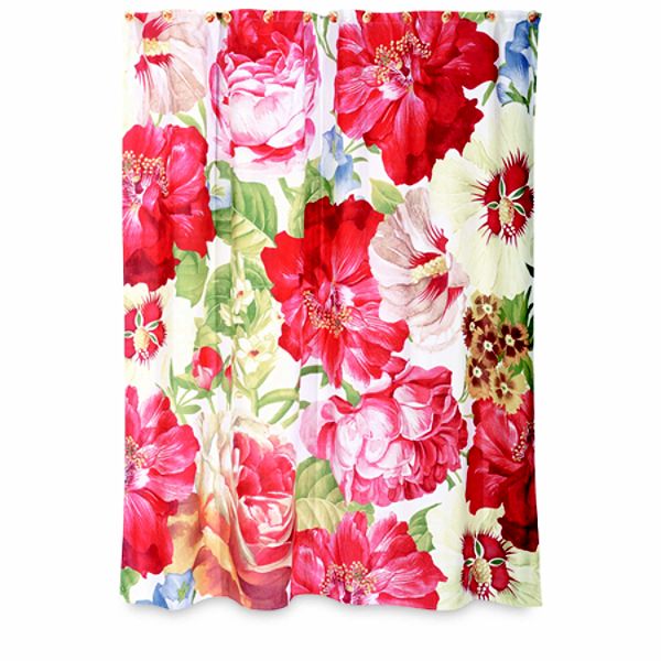


Vibrant! Bold! Beautiful! And since it would be the only floral thing in the room, it wouldn't be too painful for Mr. Bethany to endure seeing on a daily basis. It just felt like it would fit this classy beautiful image I had in my head for how my bathroom here could look! But as I looked around to see where I could get the best deal for it, I saw that while most of the images online were exactly like the one above, some weren't quite so lovely and vibrant.


Cue the sorrow. This muted version looks nothing like the vibrant version I adored. It is more grandma's country cottage than the vintage Hollywood starlet retreat I pictured. But I had hope! Since almost every image was like the bright one from Sears, I thought perhaps that was how it really looked. I couldn't find any pictures of it in any homes, so I sought out reviews. The only ones I found were from people that said it was much bolder and bright than the coordinating bath accessories, so that just seemed to make it almost a guarantee that I'd get my precious curtain in the vivid pinks and reds and greens! So, I found a good deal on an Ebay auction, and I went for it!


And it arrived.


Decidedly more like #2 than the one that wooed me. The thing is, I could TRY to make it work in the space. But I can't seem to get over how stretched out the images are on the curtain.


Such a small detail, I know. But it bugs me. Because of a mix-up at the post office, I didn't get this until it was too late to return it to the Ebay seller. So I will either keep this and use it, or try to sell it to get my money back. If you made it through this entire post, I thank and congratulate you. Now I need your opinion! What do you think? Does the stretched out image seem like a big enough deal? Is it more Reba than Marilyn, like I think? Help!

Thursday, March 17, 2011

One little snowman.

It is so hard to believe that March is already half-way over! This new year is flying by too fast. I think that happens more when you're an adult. As a kid, time drags between breaks from school and important events. As an adult, sometimes life is a bit too busy to recognize when a "I'll give you a call sometime next week." will slide right into a "Crap. I was supposed to call you three weeks ago."

Since we only have a 3 days of Winter days left, I wanted to rush over and post my Winter door decor before it was too late and I change it! Because the door is a total wreck, I am showing just the close-up I took of the snowman wreath I made a few years ago. I got the snowman and the ribbon (I think.) at A.C. Moore for cheap. The rest of the wreath is just the basic round shape with the same snowflake ribbon wrapped around it. I kept it simple. When I bought him to put on the wreath, I jokingly named Mr. Flakes. Normal people totally name inanimate objects, right? I suppose I can't be blamed entirely. He has quite a lot of character.


A bit of good news regarding the disgusting door is that the office says they will be replacing my door with a new four-panel steel door this Spring! (The downside is it will be painted the same gross hunter green, and the new door will have a half-moon window at the top. I'm not a fan of that style as, to me, it seems so dated. Oh well!) I will probably have to be a smidge obnoxious about pressing to make it actually happen, but I am up for the task. Be gone, rusty/pockmarked door!

Saturday, March 5, 2011

Wall paint and Amy Butler fabric and gallery walls, oh my!

The biggest problem with my new place is that I do not have the time, energy, and resources to make it home yet. I threw together a bit of a gallery wall in the living room a few hours before my parents came to visit at the end of December, and have since tweaked it a bit more. Beyond that, not a lot has happened.

I am dying to get some color on the walls in this place. I have a few cans of new paint that never saw light, so I will try to use those rather than buy all new paint for the rooms. I do so love the Oops/Mis-tints in Lowe's and Home Depot, so I have picked up full gallon of beautiful silver gray and one of a nice spring green. And I have some partially-filled cans of greens and pinks. I am picturing an obnoxiously cutesy hallway color with one of the pinks because the small hallway that connects the laundry room/bedroom/bathroom deserves to a little sass. We'll see how it all turns out when I swatch a bit on the walls to test.

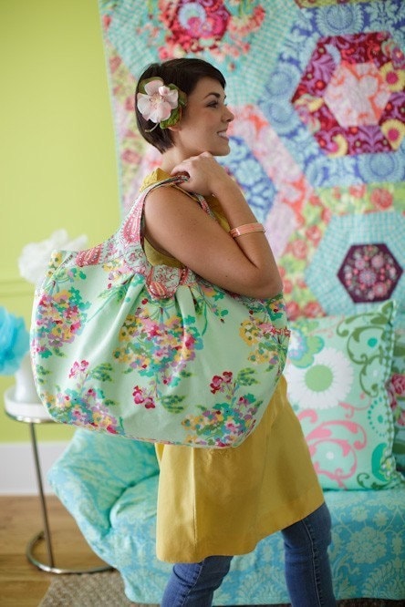
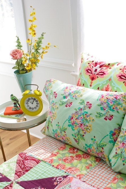
I did manage to snag some free paint sample pots from Valspar in some of the turquoise and aqua (and Tiffany blue-esque) colors I have been admiring so I can get a better idea of what I want to do in my bedroom. There is a fabric I am loving that I think I want to use to make curtains for the big bright double window in my bedroom. Curtains are SO expensive, and I am far too picky to be satisfied with most retail options, so I will just make something perfect myself. When I came across this print a while back in an Etsy fabric shop, I fell in love. I didn't have any idea what to do with it then, so I dismissed it as something lovely that just wouldn't work out. But I stumbled across it again when I was hunting for mint or aqua or turquoise in prints for my bedroom, and my love for it hasn't waned. Just look at how lovely it is!


It is Water Bouquet in Mint from Amy Butler's Love collection. It seems to be a delicious impressionist-style floral that is common to some vintage fabric patterns I love. I snagged the images here from the Etsy seller I might use for the purchase. Her store is called lilybellafabrics, and she has some gorgeous designer prints available. I'm waiting to hear back from her to see if I can buy a swatch of it from her to see if I still love it in person. 

I might also get a swatch of the same print in the other available colorway - Midnight. Here is a peek of that one. It seems to be most of the same bouquet colors, but with the deep blue background instead of the mint. I could still use the colors I have selected for the room if I went with this one, so I'm curious to see it up close and see how it looks in my space.


What do you think of them?

Wednesday, November 24, 2010

Time keeps slipping through my fingers.

It has been almost a month since we moved into this apartment. As always, the longer we live in a place, the more flaws we notice. In a rental apartment there are some things we cannot really fix ourselves, but aren't considered a real problem by the community management. Some bumps from patch jobs on the walls? Excessive use of white caulk? Obnoxious vinyl tiles in the entryway and kitchen? Ick. These are things I either have to live with or find a way to mask them. There are a few things here and there that need help and will be fixed, though. A few cracked tiles in the bathroom, issue with the bathroom ceiling, etc. I might even be able to get them to replace the countertops in the kitchen. A previous tenant used them as both an ash tray and a cutting board at some point. Classy, right?

Enough chatter about the problems with the place. Since I haven't had the time or money to do very much in the way of primping and decorating here yet, I relish the little things. I wanted to share two pictures with you. The first is a little wreath I made for my front door. The door is junk, so I thought I should put some lipstick on the pig. I snagged a few things from the teeny amount of remaining clearance Fall decor stuff at Michaels a couple weeks ago. The wreath was pieced it together in about 10 minutes time using the flowers, ribbon, and scarecrow lady from Michaels, and a plain wreath I'd purchased at Dollar Tree a while back. I'm not entirely happy with it, but my husband loves it. He is even kind enough to claim it looks like the kind you can buy pre-made in the stores. Aww.

Tada! I might save this one and make it look nicer so I can use it next year.

I picked the colors for it from the clearance mums I snagged at Walmart for $1 apiece! They were the most beautiful shades of magenta and orange. I snagged a small yellow pot, too, but it lived in my bedroom until recently. I wasn't able to cover the basic plastic pots or replant them, though, so this picture isn't entirely impressive. There is a good bit of landscaping I want to do out front. Oh, Time, why can't I have more of you?

The pops of color help brighten the place up a bit.

So, there you have it. Here is my sad little display of Fall decor that cost about $7 total. There are still three weeks or so of Autumn left, so I might add a cheap rug at some point. If I do, I will show you. :)

Tuesday, October 26, 2010

A new chapter begins.

Despite only living in my current apartment on the bottom floor of a 1920's house (don't get too excited, it had been remodeled  enough to lose 70% of the vintage charm when they converted it into a duplex) for a year, it is time to move. My current landlord wants to rent the space to his cousin, so Tony (my husband) and I had to go find a new place to live. We ended up finding a new space that will give us more room to breathe. We moved from a two bedroom 840 sq. ft. apartment last year to the current one bedroom 559 sq. ft. place. Needless to say, we are excited to have room to breathe again. We signed the lease and got the keys and this Saturday is the big move-in!

Here is the layout!

The downside of returning to an apartment complex from an old (despite the damper) house is decorating a space that has no architectural character whatsoever. Unless you count hideous soffits, and I don't. This blog will be my space to show how I turn a bland boxy apartment into a home. Welcome to 716, everyone. Please take your shoes off when you come inside. 

The front door looks kinda gross and is in need of help.